Savings Plans
DigitalEx has added support for AWS & Azure Savings Plans. By being able to view the cost of Savings Plans and optimize them, you can take advantage of the cost savings and flexibility that these plans offer. With the ability to view and analyze your Savings Plan usage, you can make more informed decisions about your usage and effectively optimize your Savings Plan strategy. This can help you save money on your AWS & Azure combined costs and better manage your budget.
List of supported services
Virtual Machines
Azure Spring Cloud
Functions
Azure App Service
Container Instances
Utilization
The utilization widget displays the percentage of the Total Savings Plan that has been used for the selected month. It also compares the current month's utilization data to the previous month and indicates whether there has been an increase or decrease in the percentage.
Savings Plan Spend
The Savings Plans cost widget displays the total cost of Savings Plans for the selected month. It shows the amount that the Savings Plans have cost during that specific month.
On-Demand Equivalent
The on-demand equivalent widget shows the cost of using On-Demand resources for the same amount of usage as your Savings Plans, based on current On-Demand rates. This comparison allows you to see the cost difference between using Savings Plans and On-Demand resources.
Net Savings
The net savings widget displays the amount of money that you have saved by using Savings Plans for your usage, compared to the cost of using On-Demand resources for the same usage. This widget helps you see the financial benefits of using Savings Plans by showing the actual savings that you have achieved.
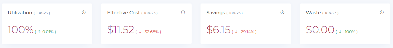
Data does not include usage covered under free tier or credits
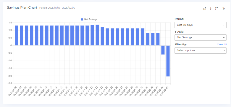
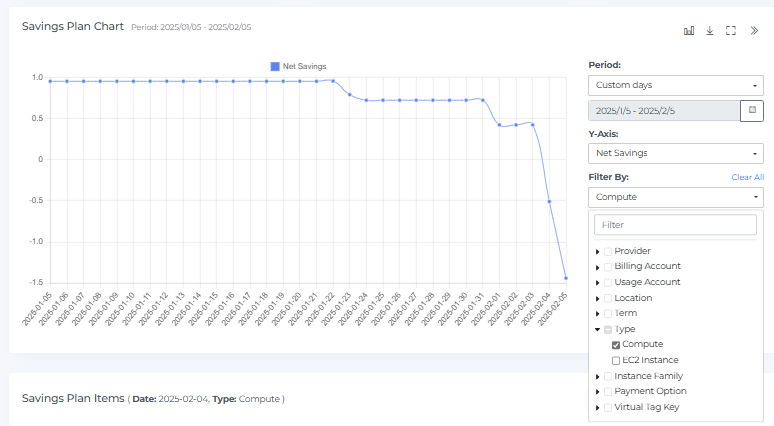
Savings Plan Chart
The Savings Plan Chart provides a graphical representation of the used and unused commitments for each month. You can hover your mouse over the chart to view the used and unused commitments, utilization percentage, and net savings for each month. By clicking on a bar in the Savings Plan chart, you can see the data displayed in the Savings Plan Widgets, Geo Chart, and Savings Plan items.
You can expand or minimize the view of the Savings Plan Chart by clicking the square icon. You can also download the chart by clicking the download icon. This allows you to save the chart and view it offline or share it with others.
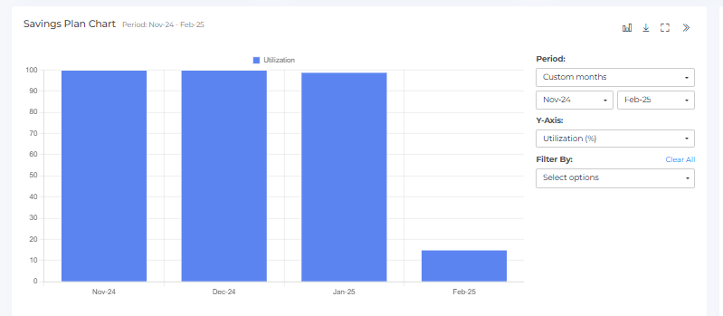
The "Period" selection allows you to filter cost data by different time ranges, such as monthly (e.g., "Last 12 months"), weekly, or daily (e.g., "Last 30 days," "Last 90 days"). This helps analyze spending trends over specific timeframes.
You can customize the data displayed on the chart by changing the Y-axis to view utilization commitments, utilization percentages, or net savings. This allows you to focus on specific aspects of your Savings Plan usage and get a more detailed understanding of your Savings Plan performance.
The Savings Plan Chart provides the option to switch between different chart types, such as bar charts and line charts, to visualize the data in different ways. This feature allows you to choose the chart type that best suits your needs and helps you understand your Savings Plan usage more effectively. By switching between different chart types, you can see the data in a way that is most meaningful to you and better understand your Savings Plan performance.
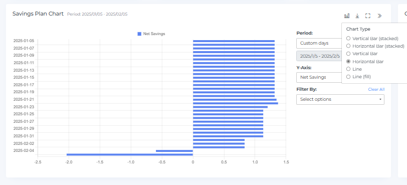
The Savings Plan Chart provides the option to filter the data using various options. For example, you can filter the data by date range, service, or usage type to narrow down the data and focus on specific aspects of your Savings Plan usage. This can help you better understand and analyze your Savings Plan usage. By using the filtering options, you can more easily identify trends and patterns in your Savings Plan usage and make more informed decisions about your Savings Plans.
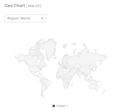
Geo Chart
The Savings Plan Geo Chart displays the data points for the selected month, showing the number of different types of Savings Plans in each region. You can hover your mouse over the data points to view the region name and the number of Savings Plans in that region.
The maroon color represents a higher level of Savings Plan usage in that particular location. If there are two data points that overlap, a small magnifying glass icon is displayed.
You can use the drop-down menus to change the location and month, allowing you to view data from different regions and months. This can help you understand the geographical distribution of your Savings Plan usage and identify any trends or patterns. By analyzing the data in the Savings Plan Geo Chart, you can gain insights into the regional distribution of your Savings Plan usage and make more informed decisions about your Savings Plans.
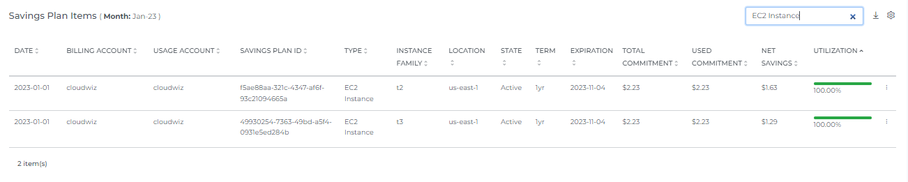
Savings Plan Items
The Savings Plan Items display a list of all the Savings Plans for the selected month. By default, this list includes all the Savings Plans that were used during that month. The list includes details such as the Savings Plan type, the usage type, the region, and the cost savings achieved. This can help you understand the specific Savings Plans that were used during the selected month and how much money was saved through the use of these plans. You can use this information to identify which Savings Plans are most effective for your usage and optimize your Savings Plan strategy accordingly. When you select the number of rows, you will be able to view that same quantity of rows on the page.
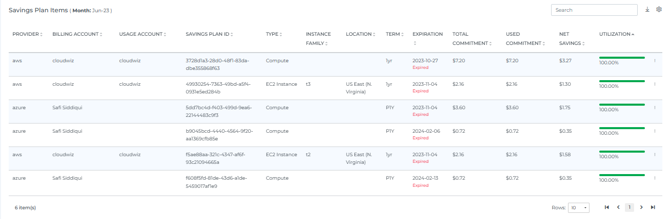
When you click on a specific bar in the Savings Plan Chart, the Savings Plan Items will display the associated Savings Plan for that particular item. For example, if you click on a bar representing the data for the us-east-1 region, the Savings Plan Items will show the Savings Plans used in that region.
The Savings Plan Items can be sorted, searched, and downloaded. You can also click on the settings icon to change the way the data is displayed. The number of Savings Plan Items displayed will depend on the selection you make in the settings. This can help you more easily analyze and understand your Savings Plan usage. By using these features, you can easily view and analyze the data in the Savings Plan Items to gain insights into your Savings Plan usage and optimize your Savings Plan strategy accordingly.
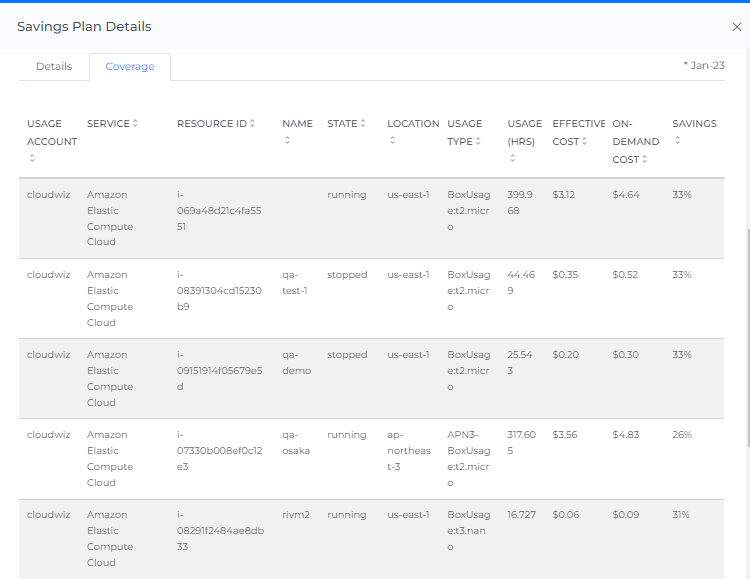
If you click on the three dots in the upper right corner of a specific Savings Plan, you will be able to access additional information about that plan. This includes a utilization percentage graph, details about the utilization of reserved instances (RIs), and information about the coverage provided by the Savings Plan. This can help you better understand the performance and effectiveness of each individual Savings Plan. By viewing this additional information, you can gain insights into how well each Savings Plan is performing, and identify any areas for improvement or optimization. This can help you make more informed decisions about your Savings Plans and maximize your cost savings.
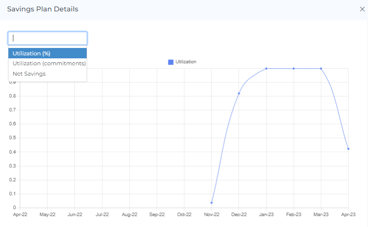
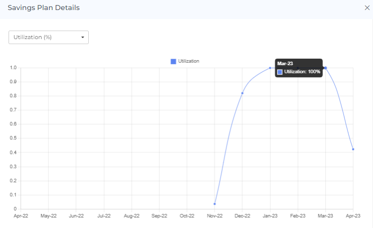
In the utilization percentage graph, you can choose to view utilization percentage, utilization commitments, or net savings. When you hover your mouse over the graph, you will see the related month's utilization percentage for that data point. This allows you to see how the utilization percentage has changed over time and how it compares to the other data points. By viewing the utilization percentage graph, you can get a sense of the overall performance of the Savings Plan and identify any trends or patterns in the utilization percentage over time. This can help you understand how well the Savings Plan is being used and make more informed decisions about your Savings Plans.
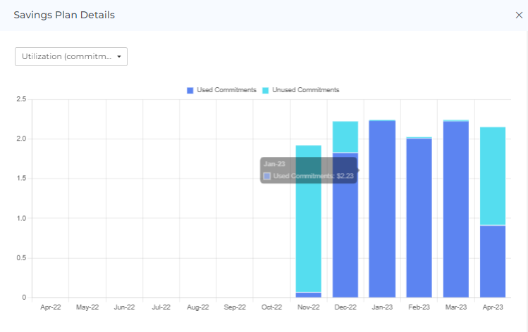
If you choose to view utilization commitments in the utilization percentage graph, you will be able to see the related month's used and unused commitments when you hover your mouse over the graph. This can help you understand the distribution of used and unused commitments for each month and how it has changed over time. By viewing the utilization commitments in the graph, you can get a sense of how well you are utilizing your Savings Plans and identify any trends or patterns in the distribution of used and unused commitments. This can help you optimize your Savings Plan usage and maximize your cost savings.
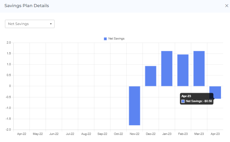
If you choose to view net savings in the utilization percentage graph, you will be able to see the net savings for each month when you hover your mouse over the graph. This allows you to see how your Savings Plan usage has resulted in financial savings over time. By viewing the net savings in the graph, you can get a sense of the overall financial benefit of your Savings Plans and identify any trends or patterns in the net savings over time. This can help you understand the financial impact of your Savings Plan usage and make more informed decisions about your Savings Plans.
When you click on a bar in the utilization percentage graph, the related month's details and coverage will be displayed. For example, if you click on the bar representing the data for October 22nd, you will see the details and coverage for that month.
The details and coverage information can help you understand the specific Savings Plans that were used during the selected month, as well as the overall coverage provided by those plans. This can help you more effectively analyze and understand your Savings Plan usage. By viewing the details and coverage information, you can gain insights into the Savings Plans that are being used and how they are contributing to your overall cost savings. This can help you optimize your Savings Plan strategy and maximize your cost savings.
Header Icons

Share
If you click on the "share" link, a link to the current page will be copied to your clipboard. You can then share this link with other team members, allowing them to access the same data and filters as you. This can be useful for collaborating with others and sharing information about your Savings Plan usage.
SP Utilization Filters
Basic
The filter option allows you to narrow down the data displayed on the page to specific criteria. You can use the filter to view Savings Plans for a particular billing account, usage account, location, term, type, instance family, or payment option. This can help you focus on specific aspects of your Savings Plan usage and more effectively analyze and understand the data.
On selecting Dynamic Filter adjusts options based on previous selections. For example, choosing a Provider will update subsequent filters (e.g., Billing Account, Locations) to show only relevant data for that provider. This ensures efficient and context-sensitive filtering.
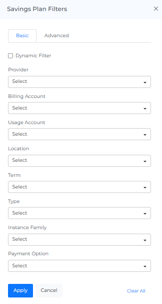
Advance
The "Advanced SP Filters" feature use to apply detailed filters to refine search results. You can add multiple filters by selecting criteria like "Provider," choosing an operator (e.g., "IN"), and selecting values from dropdown menus. The interface includes options to apply or cancel changes and a "Clear All" button to reset filters.

Screenshot
If you click on the camera icon, you can take a screenshot of the current page and download it as a PDF file. This can be useful for saving a copy of the data or for sharing it with others.
Reload Option
The "reset" option allows you to clear all filters and selections from the page, returning it to the default view. This can be useful if you want to start over or view the data in its original form.
Info
The "last updated" date and time stamp show when the data on the page was last refreshed. This can be useful for understanding the age of the data and determining if it is up to date.
Help
If you click on the "?" icon, you can access the help documentation for the page. This can provide you with additional information and guidance on using the page and its features.