Datacenter Resources
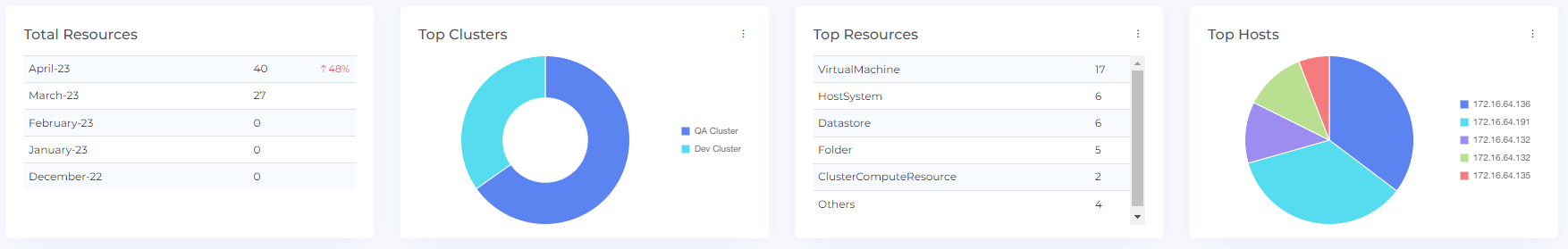
Total Resources
The total resources widget displays the total number of resources for all the onboarded datacenter. This can help you understand the overall scale of your resource usage and track changes over time.
The total resources widget also includes information about percentage increases or decreases from the previous month. This can help you understand how your resource usage is changing and identify trends or patterns.
Please note that resource percentage increases and decreases are not displayed for the first month of onboarding. This is because there is no previous month's data to compare against. Data for the total resources widget will only be displayed from the month in which the usage account was onboarded.
You can use the total resources widget to track the growth of your resource usage over time and identify opportunities for optimization. By understanding the total number of resources you are using, you can make informed decisions about how to allocate and manage your resources more effectively.
Top Clusters
The Clusters widget displays the top Cluster based on their cost. This can help you identify the Clusters that are contributing the most to your overall cluster costs and understand where you may be able to optimize your cluster usage to reduce costs.
You can mouse hover over the donut chart to view the cost of each individual cluster. You can also click on the donut chart to view data for a specific cluster. When you do this, the resource chart and resource items table will be updated to display data for the selected resource.
The resource chart and resource items table provide additional information about the selected cluster, including details about its usage and cost over time. You can use these features to analyze the cluster and identify opportunities for optimization.
By understanding the top clusters, you can focus your efforts on optimizing the resources that are having the biggest impact on your costs and make informed decisions about how to allocate and manage your resources more effectively
Top Resources
The top number of resources widget displays the top resources based on the number of resources being used. This can help you understand the overall scale of your resource usage and identify areas where you may be able to optimize your resource allocation.
You can click on the top number of resources table to view data for a specific resource. When you do this, the resource chart and resource items table will be updated to display data for the selected resource.
The resource chart and resource items table provide additional information about the selected resource, including details about its usage and cost over time. You can use these features to more closely analyze the resource and identify opportunities for optimization.
By understanding the top resources by number, you can focus your efforts on optimizing the resources that are being used the most and make informed decisions about how to allocate and manage your resources more effectively.
Top Hosts
The Top location widget allows users to see the distribution of resources across different hosts. By hovering the mouse over the pie chart, users can see the specific resources associated with each location. They can also click on the pie chart to view data for a particular location in more detail, including a resource chart and resource items. This type of widget can be helpful for understanding how resources are being used in different hosts and for making informed decisions about resource allocation. The widget is interactive, allowing users to see more detailed information about the resources in each location by hovering the mouse or clicking on the pie chart.
Widget Builder
The Top Resources, Top Clusters, and Top Hosts widgets can be customized to suit your specific needs. To customize this widget, you can click on the three dots next to the widget name and select the "Edit" option. This will allow you to adjust the data displayed in the widget based on your preferences.
If you want to restore the customization to the default settings, you can click on the "Restore" button. This will reset the widget to its original configuration.
In addition to the top-costing items displayed by default, you can also view the top 100 resources, clusters, and hosts by clicking on the "View more" option. This can provide you with more detailed information about the top-costing items and help you identify opportunities to optimize your resource usage and reduce costs.

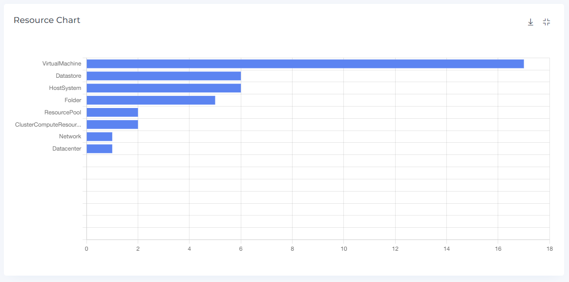
Resource Chart
The Resource Chart shows the total number of resources in a bar chart format. By hovering the mouse over the chart, users can see the specific number of resources for each time period. The chart is interactive, allowing users to click on the bars to view the resource items in more detail. Users can expand and restore the view of the chart by clicking the square icon, and they can download the chart by clicking the download icon. The Resource Chart can also be filtered using different filter options, allowing users to customize the data displayed in the chart. This type of chart can be useful for understanding trends in resource usage and for making informed decisions about resource allocation.
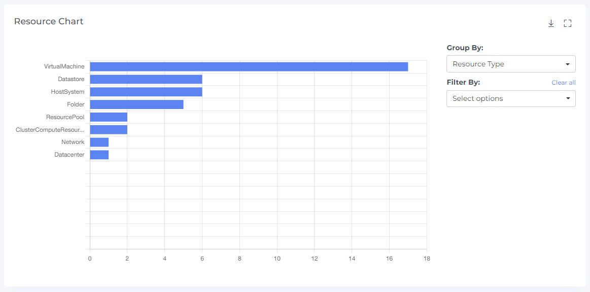
You can use the grouping feature to organize data in the chart by dividing it into different categories or groups. This allows you to see different types of data in the chart and better understand patterns and trends in resource usage. Grouping can be a useful tool for organizing and analyzing data in order to make informed decisions about resource allocation.
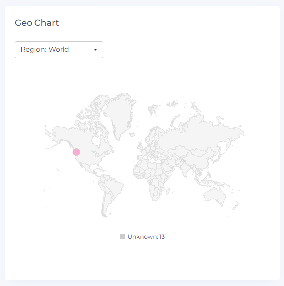
Geo Chart
The Geo chart is a graphical representation of your resource costs by region. It displays data points for the selected month and allows you to see how your costs are distributed geographically. You can hover your mouse over the data points to view the region name and the cost of that region.
The Geo chart also includes clickable data points, which you can click on to view the associated cost data in the cost items table. This can help you understand the specific items that contributed to the cost for that region. When you click on a data point, the cost chart and cost items will display data accordingly.
The maroon color in the Geo chart indicates regions where you have incurred higher costs. If there are two data points that overlap, a small magnifier icon will be displayed.
You can change the location and month from the drop-down menus to view data from different regions and months. This can allow you to understand how your resource costs have changed over time and identify trends or patterns.
You can also see the resources for the Global & Unknown hosts in below the geo chart
Resource Items
Resource items show a list of all the resources used. This information can help you understand how resources were used over a specific period of time and identify patterns and trends in resource usage.
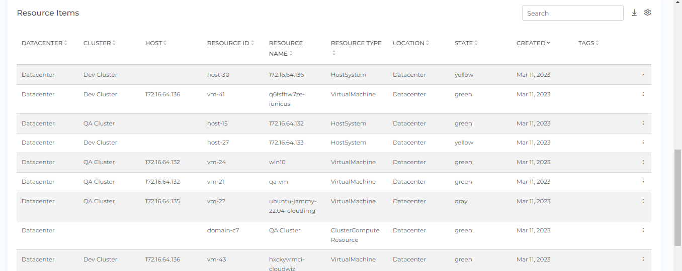
The Resource items show the specific resources associated with a particular location or point on a chart when clicked. It allows users to sort, search, and download the displayed resource items, and they can customize the view of the UI by using the settings icon. When a selection is made in the settings, the Resource items display will show the corresponding data. This tool can be useful for understanding the distribution of resources across different hosts and for making informed decisions about resource allocation.
By clicking on the three dots located in the right corner of the resource, you can access the Resource details and Cost details for that particular resource. You can also hover the mouse over the bar to see the cost. This information can help you understand more about the resource and its associated costs.

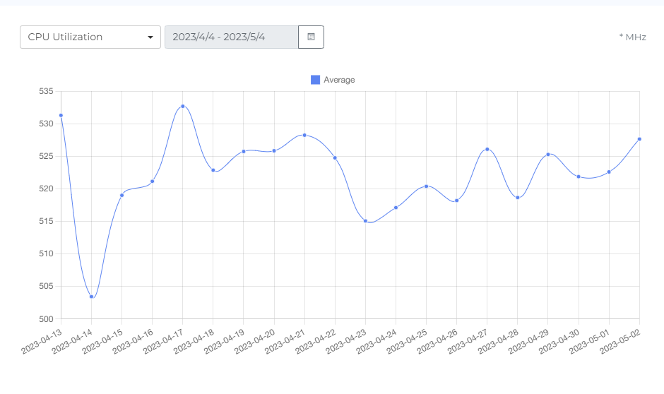
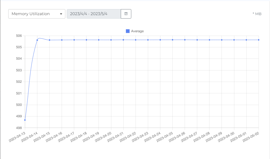
Metrics
The monitoring graphs (Metrics) for different datacenter and its resources allow users to see the usage and performance of these resources over time. By clicking on the three dots in the corner of the resource instance, users can access the metrics for that particular instance and change the metric type using the drop-down menu. They can also strikethrough to manage the statistics and hover the mouse over the dots on the line graph to see usage data for daily intervals. If the daily interval is selected, users can set the date range up to the last 30 days. This type of information can be useful for understanding how resources are being used and for identifying any potential issues or opportunities for optimization.

Header Icons
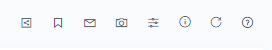
Share
Click on the Share link, copy the link of the current page, and filter if anywhere you can share it with other team members
Screenshot
Clicking on the Camera icon, take a Screenshot of the current page, and downloads it in a pdf file.
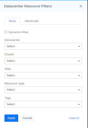
Datacenter Resource Filters
Basic
You can filter the complete page using this option. For Example, if you want to view the Resources datacenter, select the datacenter filter, or you can view the Resources of a particular datacenter, Cluster, Host Resource Type
On selecting Dynamic Filter adjusts options based on previous selections. For example, choosing a Datacenter will update subsequent filters (e.g., Cluster, Host) to show only relevant data for that provider. This ensures efficient and context-sensitive filtering.
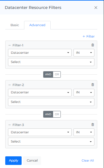
Advance
The "Advanced Datacenter Resource Filters" feature use to apply detailed filters to refine search results. You can add multiple filters by selecting criteria like "Datacenter," choosing an operator (e.g., "IN"), and selecting values from dropdown menus. The interface includes options to apply or cancel changes and a "Clear All" button to reset filters.
Info
Last updated date & time.
Reload Option
It clears all the filters, and selections from the page and shows you the default page.
Help
You can use the Help Page Documentation by Clicking the '?' Help icon.