Coverage
DigitalEx, Coverage feature allows you to view the AWS, GCP & Azure combined coverage provided by reserved instances (RIs) and Savings Plans. You can see the amount of cost that these resources have covered, helping you understand how well they are contributing to your cost savings. By viewing the coverage provided by Reserved Instances and Savings Plans, you can gain insights into the effectiveness of these resources and make more informed decisions about your usage. This can help you optimize your resource usage and maximize your cost savings on AWS, GCP & Azure
List of supported services:
Virtual Machines
Azure Spring Cloud
SQL Database
Azure App Service
Azure Data Factory v2
Azure Database for MySQL
Azure Database for PostgreSQL
Functions
Azure databricks
Redis Cache
Coverage
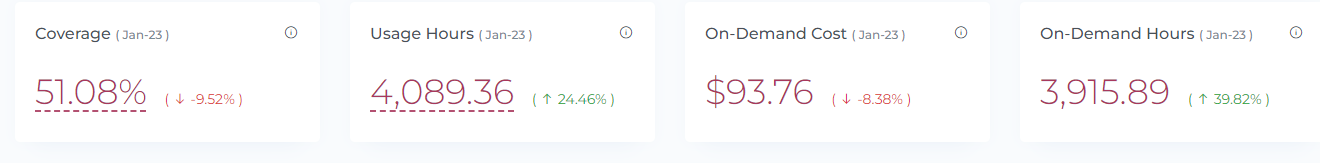
The coverage widget shows the percentage of Total Reserved Instances and Savings Plans for a given period combined for AWS, GCP and Azure If the percentage changes from the previous month, it will be displayed as an increase or decrease. If you click on the dashed line, you can view the individual percentages for each Reserved Instance and Savings Plan.
Usage Hours
The Usage Hours widget shows the total number of hours that Reserved Instances and Savings Plans were used during the specified period combined for AWS, GCP and Azure. If you click on the dashed line, you can view the usage hours for each individual Reserved Instance and Savings Plan. If the usage hours change from the previous month, the percentage increase or decrease will be displayed.
On-Demand Costs
The On-demand Cost widget shows the total amount of money that was spent on on-demand usage during the specified period combined for AWS, GCP and Azure. If the on-demand usage cost changes from the previous month, the percentage increase or decrease will be displayed.
On-Demand Hours
The On-Demand Hours widget shows the total number of hours that were spent using on-demand resources during the specified period combined for AWS, GCP and Azure. If the on-demand usage hours change from the previous month, the percentage increase or decrease will be displayed.
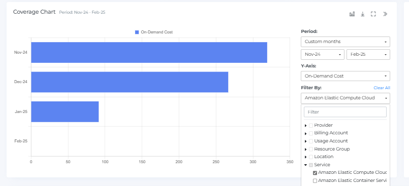
Coverage Chart
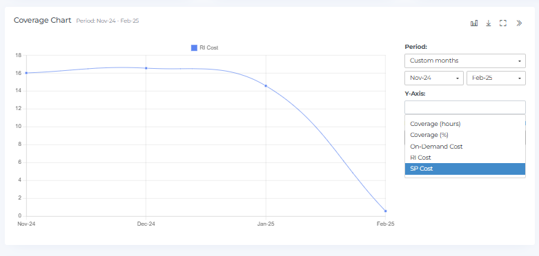
The Coverage Chart provides a visual representation of the usage and cost data for Reserved Instances, Savings Plans, and on-demand resources over a number of months combined for AWS, GCP and Azure. You can hover over the chart with your mouse to see the coverage hours, coverage percentage, and on-demand cost for each month. If you click on a bar in the chart, the Coverage Widgets, Geo Chart, and Coverage items will display data accordingly. You can expand or restore the view of the Coverage Chart by clicking a square icon, and you can download the chart by clicking the download icon.
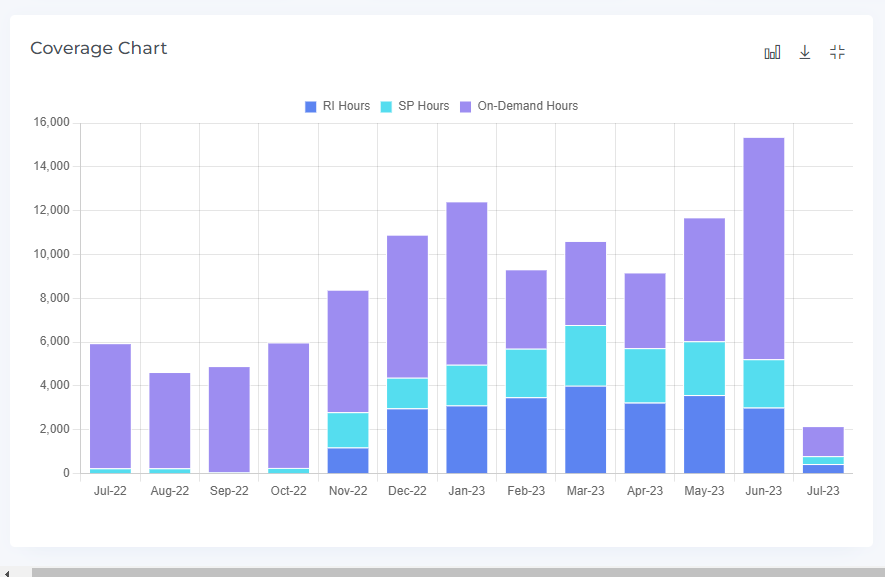
The "Period" selection allows you to filter cost data by different time ranges, such as monthly (e.g., "Last 12 months"), weekly, or daily (e.g., "Last 30 days," "Last 90 days"). This helps analyze spending trends over specific timeframes.
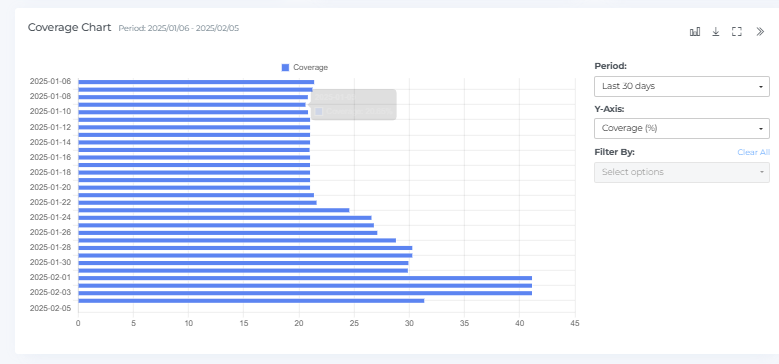
The Coverage Chart displays three different pieces of data on the Y-axis: coverage hours, coverage percentage, and on-demand cost combined for AWS, GCP and Azure. The chart shows how these values change over time, with the X-axis representing different months. You can switch between these different data sets by changing the Y-axis.
You have the ability to switch between different chart types in the RI Coverage Chart, allowing you to view the data in various formats. The options for chart types may include bar charts, line charts, and pie charts, among others. Changing the chart type can help you better understand the data and how the values have changed over time.
The Coverage Chart can be filtered using various options to display only the data that is relevant to your needs combined for AWS, GCP and Azure. By applying filters, you can narrow down the data displayed in the chart to specific time periods, regions, resource types, and other factors. Filtering the chart can help you identify trends and patterns in the data and gain a clearer understanding of how your resources are being used.
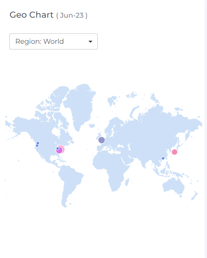
Geo Chart
The Geo Chart displays coverage data for a selected month combined for AWS, GCP and Azure. When you hover over a data point with your mouse, you will be able to see the name of the region and the coverage percentage for that region. Regions with higher coverage percentages are indicated by a maroon color. If there are two data points that overlap, a small magnifier icon will be displayed. You can use the drop-down menus to change the location and month, allowing you to view data from different regions and time periods.
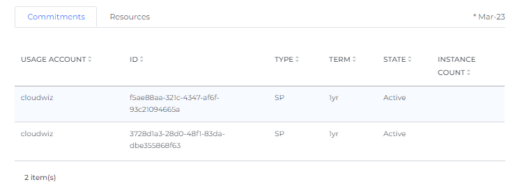
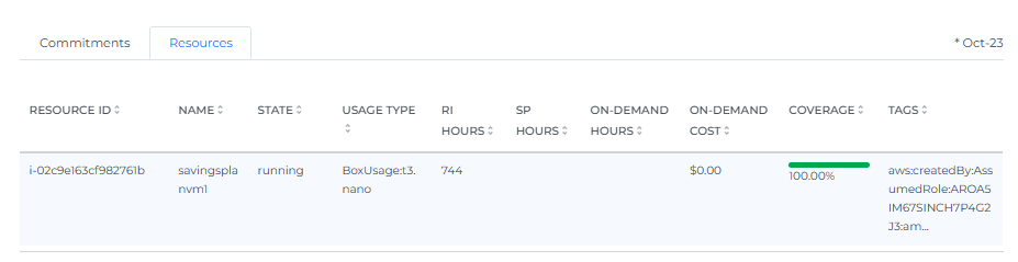
Coverage Items
By default, the Coverage item displays all the Reserved Instances and Savings Plan services for the selected month combined for AWS, GCP & Azure. It provides a list of all the resources that are being tracked, along with their associated coverage percentages and usage data. This information can be helpful for understanding how your resources are being utilized and for identifying any areas where you may be able to optimize your usage.
When you select the number of rows, you will be able to view that same quantity of rows on the page.
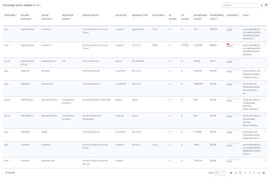
The Coverage item allows you to sort, search, and download the data that is being displayed. You can click on the Settings icon to change the way that the data is displayed in the user interface. The Coverage items will be displayed based on your selection, and you can choose which data points you would like to see. This can be helpful for organizing and analyzing the data in a way that is most useful to you.
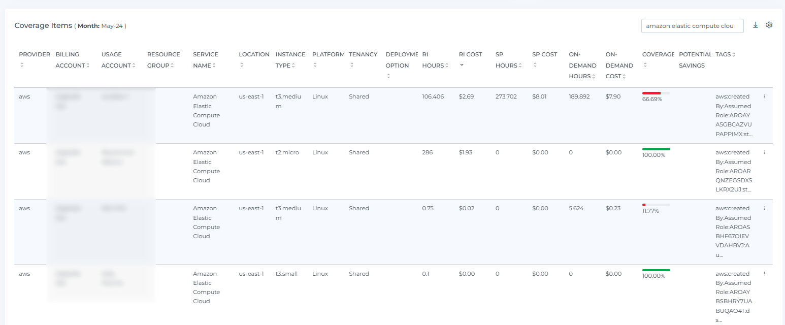
If you click on the three dots in the top right corner of a Service, you will be able to access additional information about that specific Reserved Instance or Savings Plan. This includes a coverage graph, any commitments that have been made, and a list of the resources that are associated with the reservation or plan. This can be helpful for getting a more detailed understanding of how your resources are being used and for identifying any potential optimization opportunities.
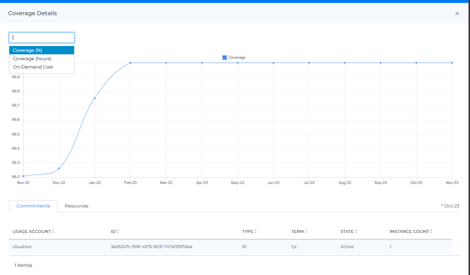
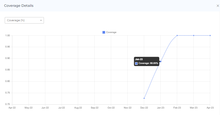
You have the option to select Coverage %, Coverage Hours, or On-Demand Cost to view the graph. If you choose to display the Coverage %, you will be able to see the coverage percentage for the related month when you hover over the graph. This can be helpful for understanding how your coverage has changed over time and for identifying any trends or patterns in the data.
If you select Coverage Hours, you will be able to see the number of Reserved Instance hours, Savings Plan hours, and On-Demand hours for the related month when you hover over the graph combined of AWS, GCP and Azure. This can help you understand how your resources are being used and identify any opportunities to optimize your usage.

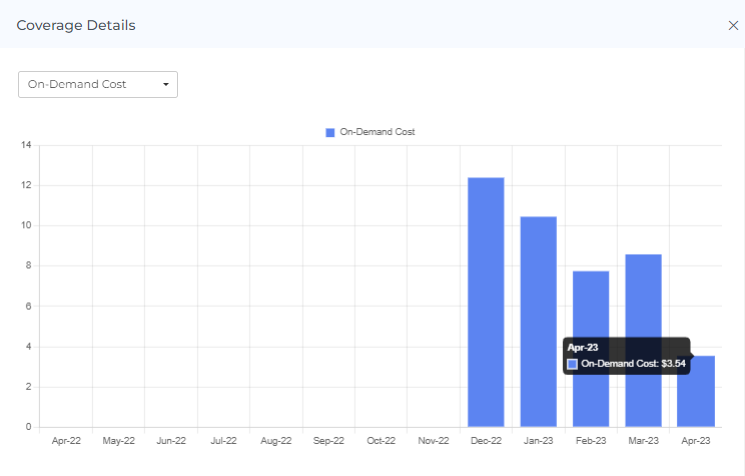
If you select On-Demand Cost, you will be able to see the total amount of money spent on on-demand resources for the related month when you hover over the graph. This can help you understand how your on-demand usage is contributing to your overall costs and identify any potential opportunities for cost optimization.
When you click on a bar in the graph, the Commitments and Resources for the related month will be displayed. For example, if you click on the bar for the month of December 2021, the Commitments and Resources for that month will be shown. This can provide you with more detailed information about your usage and can help you understand how your resources are being utilized.
Header Icons
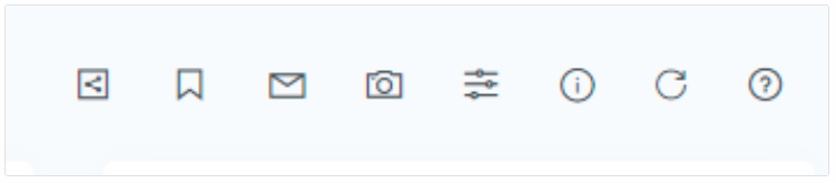
Share
If you click on the "share" link, a link to the current page will be copied to your clipboard. You can then share this link with other team members, allowing them to access the same data and filters as you. This can be useful for collaborating with others and sharing information about your Coverage page
Coverage Filters
Basic
The filter option allows you to narrow down the data displayed on the page to specific criteria. You can use the filter to view Coverage for a particular Billing Account, Usage Account, Service, Instance type, or Platform. This can help you focus on specific aspects of your RI Coverage to more effectively analyze and understand the data.
On selecting Dynamic Filter adjusts options based on previous selections. For example, choosing a Provider will update subsequent filters (e.g., Billing Account, Locations) to show only relevant data for that provider. This ensures efficient and context-sensitive filtering.

Advance
The "Advanced Coverage Filters" feature use to apply detailed filters to refine search results. You can add multiple filters by selecting criteria like "Provider," choosing an operator (e.g., "IN"), and selecting values from dropdown menus. The interface includes options to apply or cancel changes and a "Clear All" button to reset filters.

Screenshot
If you click on the camera icon, you can take a screenshot of the current page and download it as a PDF file. This can be useful for saving a copy of the data or for sharing it with others.
Reload Option
The "reset" option allows you to clear all filters and selections from the page, returning it to the default view. This can be useful if you want to start over or view the data in its original form.
Info
The "last updated" date and time stamp show when the data on the page was last refreshed. This can be useful for understanding the age of the data and determining if it is up to date.
Help
If you click on the "?" icon, you can access the help documentation for the page. This can provide you with additional information and guidance on using the page and its features.