AI Insight
This dashboard allows you to view AI model activity, focusing on usage, AI cost, performance, and utilization. It highlights the most used and most AI costly models, making it easy to track efficiency and identify trends. Performance metrics like average and p95 response times help assess model speed and stability. The utilization panel shows how effectively models are being used, including any blocked calls. Overall, it supports data-driven decisions for optimizing AI operations.
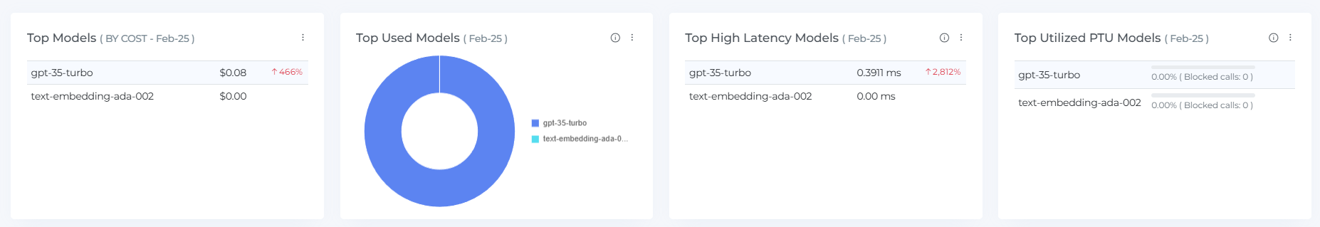
Top Models
Top Models widget allows you to view the which models incurred the most AI cost on selected month
This helps to identify expensive models and track AI cost spikes (e.g., ↑ 466%).
Top Used Models
Top Used Models highlights the most used models based on the number of tokens processed (input + output). This shows the usage is calculated based on the total tokens
This shows which models are actively used the most.
Top Performing Models
Top Performing model's widget shows how well models are performing, usually based on latency or response time. This measures model response times using average and p95 (95th percentile) metrics. Helps assess the speed and consistency of each model’s performance.
Performance score calculated based on response time metrics (avg/p95/p99). Values shown are Average & P95 response time in milliseconds."
avg = Average response time
p95 =95th percentile) shows how fast most responses are, helping you catch slow spikes.
p99 = 99th percentile (not shown in the widget but possibly used behind the scenes)
No performance data (indicated by
--), likely due to 0 usage that day.
Top Utilized Models
Top Utilized model widgets displays model utilization rates and blocked API calls. Shows how much each model was utilized and if any calls were blocked. Useful for identifying underused or throttled models.
Even if a model shows usage in tokens, this widget is about utilization rate, which may depend on capacity vs. actual use.
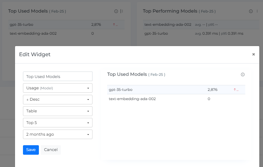
Widget Builder
The Top Models, Top Used Models, and Top Performing Models, Top utilized Models can be customized to suit your specific needs. To customize these widgets, you can click on the three dots next to the widget name and select the "Edit" option. This will allow you to adjust the data displayed in the widget based on your preferences.
If you want to restore the customization to the default settings, you can click on the "Restore" button. This will reset the widget to its original configuration.
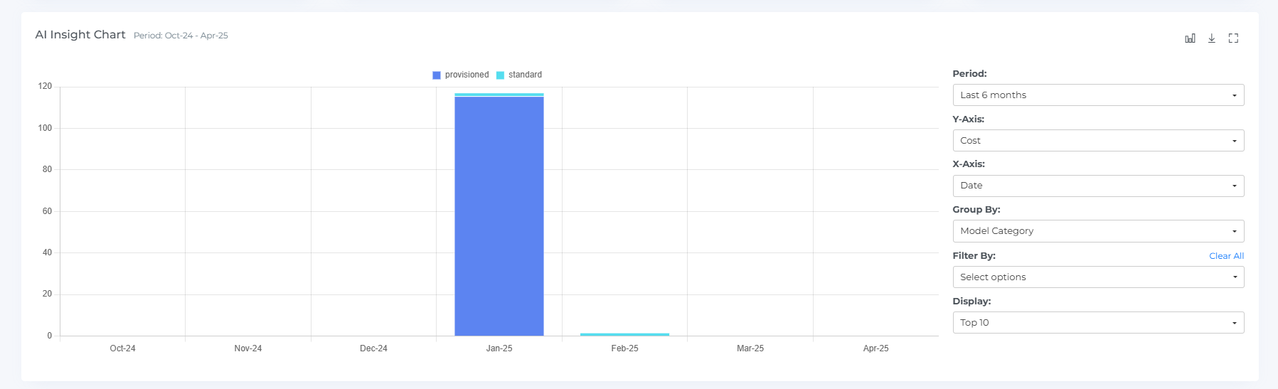
AI Insight Chart
The insights chart is a graphical representation of your service AI costs over time. It shows the AI costs for different months and allows you to see how your AI costs have changed over time. You can hover your mouse over the chart to view the AI cost for a specific month.
The insight chart includes clickable bar graphs, which you can click on to view the insights items for that specific month. This can help you understand the specific items that contributed to the overall AI cost for that month.
In addition to these features, you can also expand or restore the view of the AI Insight chart by clicking on a square icon, and you can download the insight chart by clicking on the download icon.
Insight Items
The Insights items feature displays the top detailed AI costs for the month you clicked. This can provide you with a comprehensive view of your model service AI costs and help you identify opportunities to optimize your service usage and reduce AI costs.
The Insights items table includes a variety of information about each item, including the Servic e,Model Instance, Model Category, Model, Model Type,Total Tokens, Virtual Tag and AI cost. You can sort, search, and download the insights items to better understand your model service AI costs and identify areas for optimization.
By examining the data in the insight's items table, you can identify the top-AI costing items and take action to optimize your service usage and reduce AI costs. You can also use the data in the insights items table to understand trends and patterns in your model service AI costs over time.
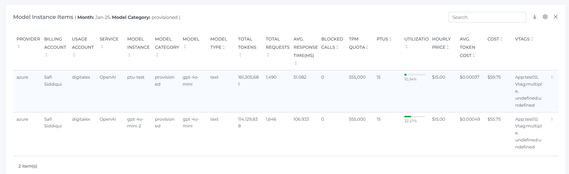
You can also customize the view of the insights items table by clicking on the Settings icon. This allows you to choose which data points to display and how they are organized. By using these features, you can more effectively analyze and understand your model service AI costs and identify opportunities for optimization.
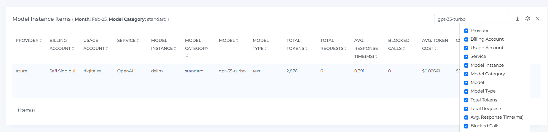
Use the close button to exit the service item list and return to the table view.
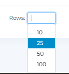
When you select the number of rows, you will be able to view that same quantity of rows on the page.
By clicking on the three dots located in the right corner of the resource, you can access the Resource details and AI cost details for that particular resource. You can also hover the mouse over the bar to see the AI cost. This information can help you understand more about the resource and its associated AI costs.
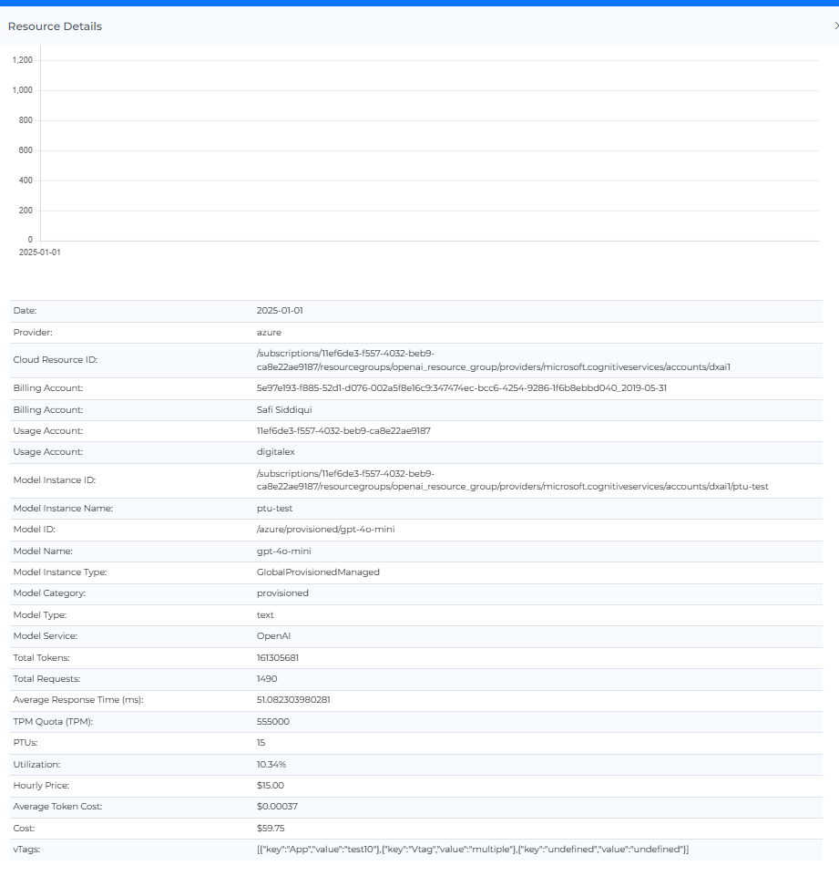
Metrics
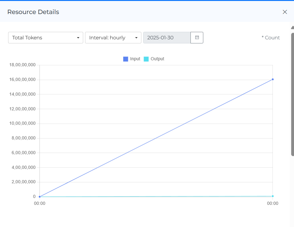
The monitoring graphs (Metrics) for different ai providers and its services allow users to see the usage and performance of these resources over time. By clicking on the three dots in the corner of the resource instance, users can access the metrics for that particular instance and change the metric type and intervals using the drop-down menu. They can also strikethrough to manage the statistics and hover the mouse over the dots on the line graph to see usage data for daily and hourly intervals. If the daily interval is selected, users can set the date range up to the last 30 days. This type of information can be useful for understanding how resources are being used and for identifying any potential issues or opportunities for optimization.

If the hourly interval is selected for the monitoring graphs, users can set a specific date to see the hourly metrics data for that date. This allows them to see how the resource was used on an hourly basis on a specific day. Hourly metrics data can be useful for understanding how a resource was used over the course of a day and for identifying patterns in resource usage. It can also help users identify any potential issues or opportunities for optimization.
Header Icons

Share
Click on the Share icon, copy the link of the current page, and filter if anywhere you can share it with other team members.
Screenshot
Clicking on the Camera icon, take a Screenshot of the current page, and download it in a pdf file.
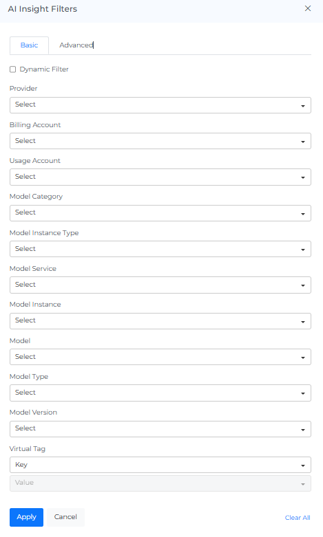
AI Insights Filters
Basic
You can filter the complete page using this option. For Example, if you want to view the AI cost by provider, select the any one filter or if you want to view the AI cost of a particular Billing Account, Usage Account, Model Category, Model Instance Type, Model Service, Model, Model Type, Model Version, Virtual Tag
On selecting Dynamic Filter adjusts options based on previous selections. For example, choosing a Provider will update subsequent filters (e.g., Billing Account, Service) to show only relevant data for that provider. This ensures efficient and context-sensitive filtering.
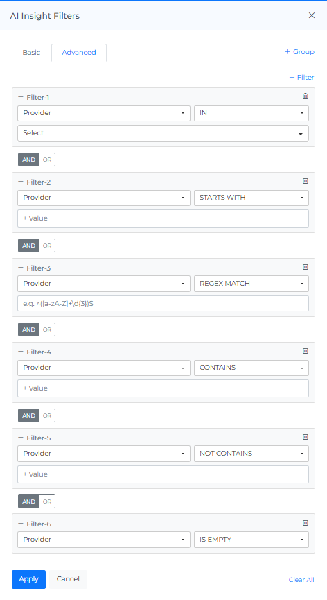
Advance
The "Advanced AI Insights Filters" feature use to apply detailed filters to refine search results. You can add multiple filters by selecting criteria like "Provider," choosing an operator (e.g., "IN"), and selecting values from dropdown menus, also you can “Group” set of filters as required. The interface includes options to apply or cancel changes and a "Clear All" button to reset filters.
Info
Last updated date & time.
Reload Option
It clears all the filters, and selections from the page and shows you the default page.
Help
You can use the Help Page Documentation by Clicking the '?' Help icon.